Hey guys!
I wanted to do some animations to my button objects using CSS, and I found out that the "transition" is the answer of everything.
No matter what pictures, what css properties you set, as long as the on and off values aren't the same, the "transition" will automatiaclly smooth everything out.
But the problem is.... with transition, I can only do very simple animations, like scale up when the button is on, scale down when it's off.
So I looked for some tutorials and they say "animation" and "@keyframe" is needed for complex animations.
But it seems that running CSS in OSC is a little different from running CSS in a browser.
I followed the tutorial and came up with this code:
:host {
  animation: upndown 0.5s ease-in-out;

}

@keyframes upndown {
    100% {
      translateX(60%) Scale(120%);
    }
  }
But apprently it's not going to work.
I was guessing it is because I didn't "trigger" the animation at all.
But even if I use the #{@{this}?} to "trigger" different animations, it's not going to work either:
:host {
  animation: #{@{this}? 'upndown 0.5s ease-in-out' : 'back 0.3s ease-in-out'};
}

@keyframes upndown {
    100% {
      translateX(60%) Scale(120%);
    }
  }

@keyframes back {
    100% {
      translateX(0%) Scale(100%);
    }
  }
So is there any way to get the keyframes and animation to work?
Thanks in advance!!
Hello Barry,
Yes, animations do work in OSC.
Basically, you missed the transform: property before using translateX and scale (all letters lowercase) and I've added some tweaks to make it work properly.
Here is the working code:
:host {
  animation: #{@{this} ? 'upndown 0.5s' : 'back 0.3s'} ease-in-out forwards;
}

@keyframes upndown {
  from {
    transform: translateX(0%) scale(100%);
  }
    to {
      transform: translateX(60%) scale(120%);
  }
}

@keyframes back {
  from {
      transform: translateX(60%) scale(120%);
  }
  to {
      transform: translateX(0%) scale(100%);
  }
}
In the animation line, you can return only the changing values, and keep the rest out as css text.
I used the forwards keyword at the end to ensure the animation stays in the last state.
2 Likes
Right! I totally missed the "transform"
Thank you again Clelson!
Can I ask you how to do other kind of conditions?
Like, if I want it to be triggered only if the current value is greater or smaller than certain number.
Oh there's another question about the "menu" object: does it have just a simple "on/off"(when it's expand and when it's in the original state) attribute that I can use for triggering my animation?
Thanks!!
Can I ask you anooother question plz  ?
?
Is there a way to refer to the values of other objects so that I only need to click once to trigger multiple animations?
You can add the condition to the ternary operator:
'condition' ? 'do this if condition is true' : 'do this if condition is false'
So, in the previous example it should look like this:
// if the button's value is greater than 3, use the upndown 0.5s animation
animation: #{@{this} > 3 ? 'upndown 0.5s' : 'back 0.3s'} ease-in-out forwards;
I don't think so. What happens in the DOM is that when the menu widget is tapped, OSC adds a class "on" to it and the menu element is rendered to the DOM. You can target it in the css prop and add the animation (no condition needed though, because once you choose a menu option or tap outside its area, the element is removed from the DOM, therefore no animation would work)
You can get values of other widgets by using this @{widget_id} syntax.
1 Like
Thank you for replying all my questions!!!
Your're really amazing 
1 Like
Hi Clelson!
You said "What happens in the DOM is that when the menu widget is tapped, OSC adds a class "on" to it and the menu element is rendered to the DOM. You can target it in the css prop and add the animation (no condition needed though, because once you choose a menu option or tap outside its area, the element is removed from the DOM, therefore no animation would work)"
But how excatly do I target the class "on"? 
Hi Barry,
Targeting a class in CSS is done by using a dot in front of the class name, like so:
.on {
    animation: #{@{this} > 3 ? 'upndown 0.5s' : 'back 0.3s'} ease-in-out forwards;
}
Thank you!
the .on{} is definitely working!
I was wondering, is it possible to assign different bg-images for each of the labels in menu?
I have assigned one bg-image for the value"1". But apparently, this kind of code cannot be used for assigning images for all the labels, because it will only happen when I last select the label for value "1"....
So is there a way for css to read the menu wedgit's own "label" attribute and use that for conditions?
Thanks for checking this out! 
You can select specific children with CSS.
The following code selects the direct children of the menu tag:
menu > div:nth-child(1) {
  background-color: red;
}
menu > div:nth-child(2) {
  background-color: lime;
}
menu > div:nth-child(3) {
  background-color: pink;
}
For this, you don't need the JS{} condition though, considering the menu options are fixed.
Cool!!
I got it working now.
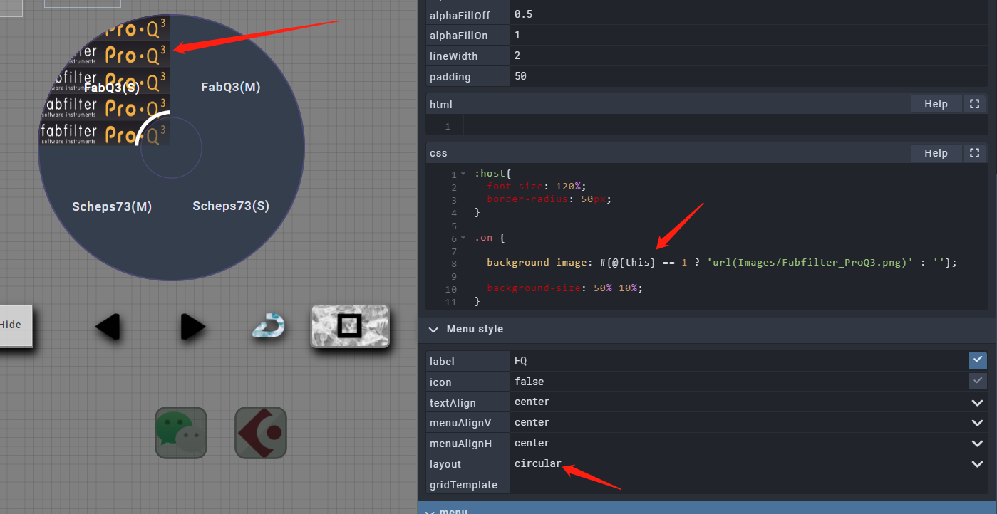
But there's another problem.
When in circular mode, the children are rotated by defalut.
But there is no way for me to rotate them back, so my images are just all rotated as well.
Well, this can be tricky to fix. It can work with 4 values, since the menu divs are perfect squares and rotating by 90 degree increments would work. But for different amount of menu values you'll need to use different angles.
Also, there is another issue which is the transform-origin that should be worked out as well.
I suggest using another menu layout, like Vertical or Grid.
You need to use !important after the css line, like so:
transform: rotate(180deg) !important;
Thank you for the suggestions!
I'm getting some interesting results. And I found out that the degrees actually doesn't matter when "!important" is used. Because rotate(0deg) always means no angle(no rotation) if the "!important" is used.
So this is how it looks when the rotate value is 65deg:

As you can see, the text is also rotating...
So I wouldn't worry about the degrees 'cause all I need to do is just to set the degree to 0 and do some position editing to the bg-image.
When it is 0deg(the image is actually in the right angle, it's just covered under the first square):

But the new problem which the text is rotating along with the bg-image, I can't really fix that 
Well it's actually the picture from the square 2 covering the square 1
Well, you can't rotate only the background image, as you could see, it rotates the entire div.
You can edit your images to fit the layout though, I think it's easier.
Otherwise, you'll need to work with pseudo css elements, like ::after and ::before, apply the background images to them. This way you can rotate them independently.
Thanks again!
I'll be looking up the ::after and ::before(have seen these kind of code everywhere but never really understood them)
And how excatly do I edit my images to fit the layout? Are you saying I should remove the texts and then edit the images?
By using an image editor, like Gimp, and rotate the image there.
I see!
Indeed that's the easiest way